Check out Gonzaga's library guide on how to evaluate information based on 4 criteria: https://researchguides.gonzaga.edu/ccow
Who created and/or is responsible for the information (author, publisher, etc.) For people: what is their educational and professional background? Is this topic in their professional "wheelhouse" or is it outside of their usual area of expertise? For organizations: What type of organization are they? What is their mission or purpose? **HINT: Google is your friend! Search an author or organization and see what comes up!
Is the information provided accurate? Do other sources come to the same conclusion independently? Is the information current or outdated? Is "loaded" language used that is trying to elicit an emotional response? Pay attention to your inner B.S. antennae! If something feels "off" or seems implausible, dig deeper!
What is the purpose of the article or website? Why was this piece of information created? What does the responsible person or organization hope to accomplish by publishing this information? Is it to broaden the understanding of a topic? Sell something? Amuse the reader? Deceive you? Convince you of a partisan opinion?
What views and biases might the author have when creating the information, that might color the interpretation or presentation of the information? Does the publication skew typically skew left or right politically? Consider your own views and biases and how that might affect YOUR reading of the information.
Review these 3 websites which all present information related to "colliodal silver." What type of information is presented and what is the objective of the website? Who is presenting the information and what is their level of expertise?
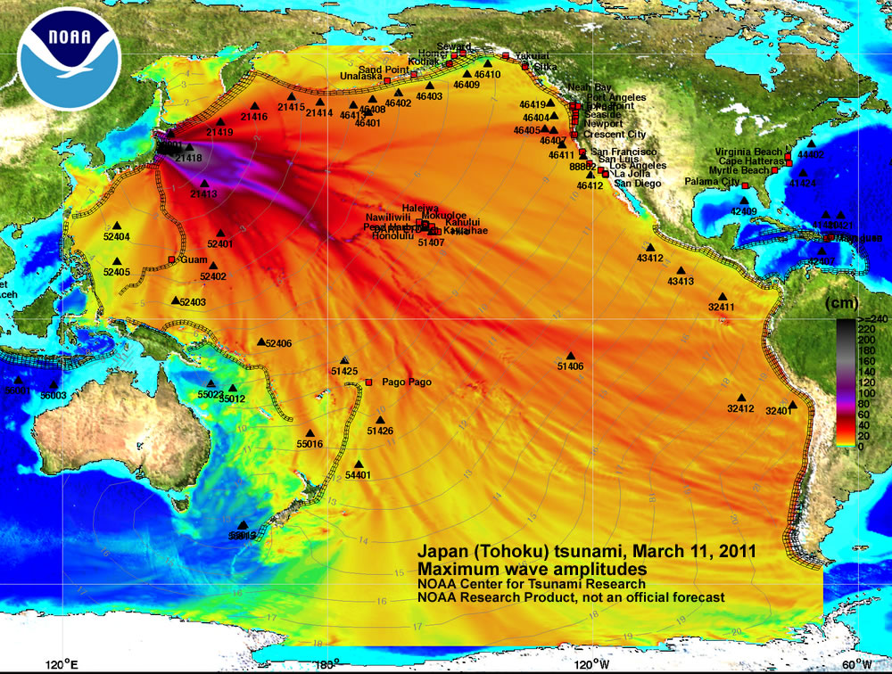
There's bad science (see links at right), and then there's purposefully deceptive disinformation. Take a look at the two images below. The first appeared in a (now removed) sensational story about deadly Fukushima nuclear radiation reaching the West Coast of the U.S. The story implies that the image illustrates how far the deadly radiation has spread via ocean currents. But, notice the map key (in cm) doesn't really correspond to anything (is nuclear radiation measured in centimeters of depth?), and neither do the "carrots" on the map:

Now, take a look at this image directly from NOAA website. What's the difference? What does the image actually depict?
